
Conversational AI Sales Lead Search
B2B / SaaS / Freemium / Self-service
My Role
Product Design,
UX Research,
Product Strategy
Team
2 ML Engineers
Software Engineers
Customer Success Manager
Timeline
3 Months
(09/2024 - 12/2024)
Status
Shipped
What wasn’t meeting requirements?
For new users
Lack of an engaging first impression: Users expected a clear “wow ” moment when interacting with the AI for the first time, but the experience felt flat.
1—
Perceived as not “AI-driven“: The workflow relied too heavily on repetitive form-filling, undermining the promise of an intelligent assistant.
2—
3—
Insufficient onboarding guidance: New users lacked clarity on how to begin and understand the tool’s value quickly.
For active users
Insufficient work flow: No shortcuts or advanced options were available to streamline the process.
1—
2—
Users had to complete every form step manually.
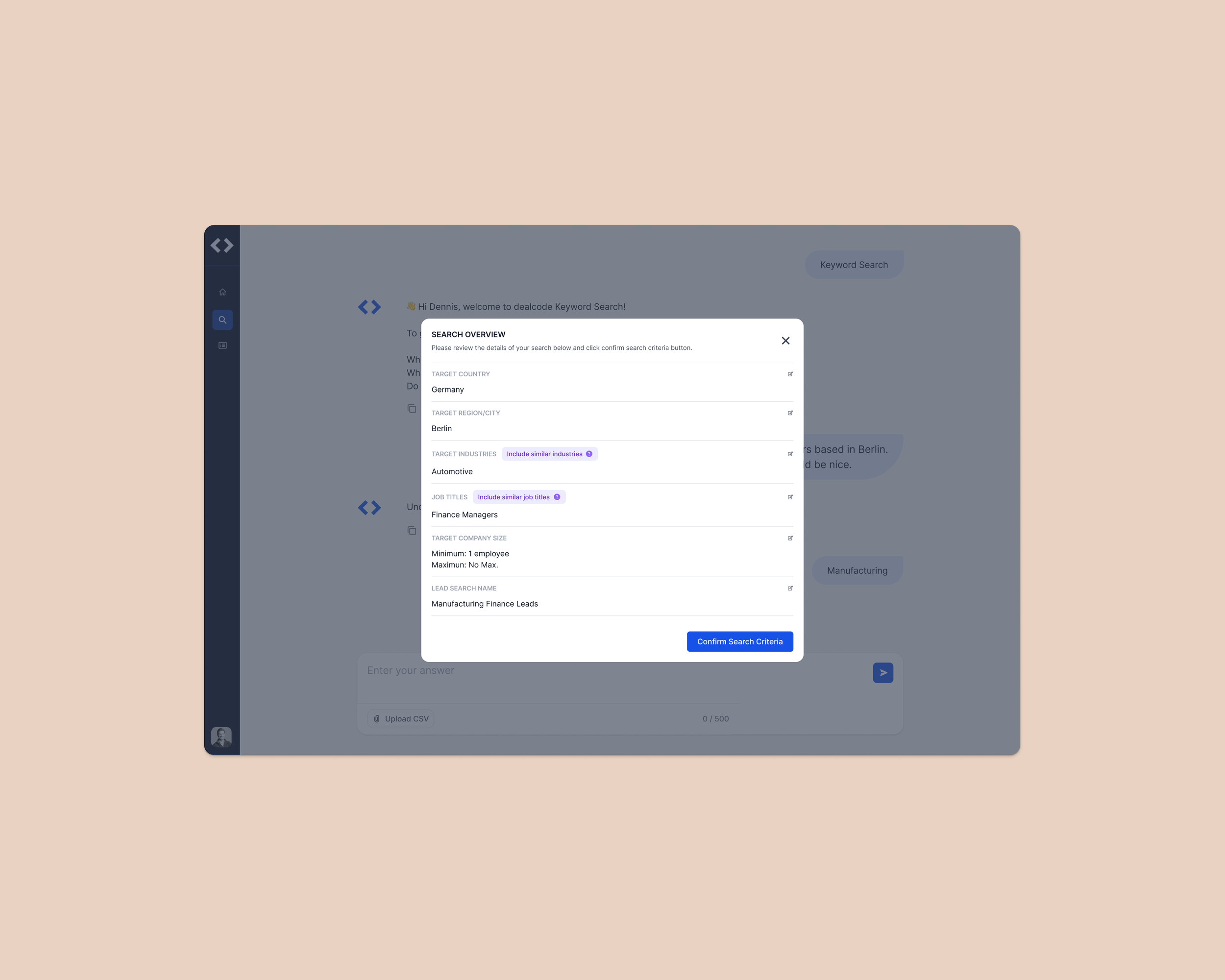
Missing confirmation step: Clicking the CTA triggered the process immediately without a review screen, leaving users uncertain and requiring extra vigilance.
3—
For business
Low new-user conversions: The lack of an initial factor failed to capture user interest and encourage adoption.
1—
Unrealized engagement opportunity: Without a compelling moment of delight, the product struggled to differentiate itself in a competitive AI-driven market.
2—
Grounding Design in People and Data
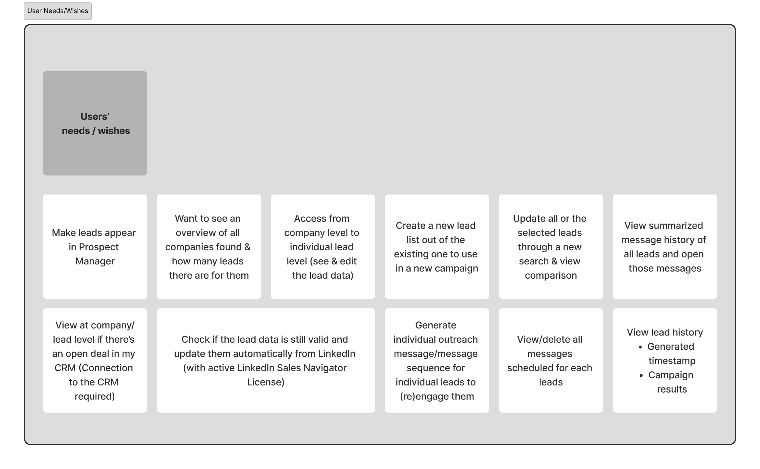
Accumulated User Feedback from Customer Success Team
1—
Surfaced recurring user wishes such as faster onboarding and more intuitive lead search.
Identified common pain points reported to Customer Success, including confusing flows and unnecessary friction in setup.
2—
Collected qualitative feedback on how users perceived the feature, highlighting both frustrations and opportunities for improvement.
3—
Aligning Needs with Data Realities
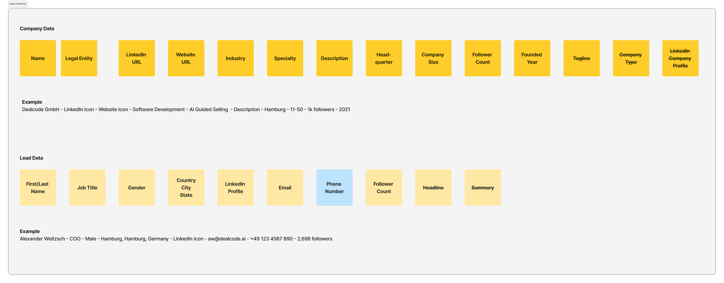
Gathered available data sets to understand what could realistically support lead search functionally.
1—
Assessed limitations of the data to identify what was not feasible within current system constraints.
2—
Defined required data inputs to ensure search results were both result and actionable.
3—
How should/could this feature work?
Deliver a seamless onboarding experience that is intuitive and engaging, lowering barriers to adoption.
For new users
Enable efficiency and support deeper use of advanced features, turning the tool into a daily driver.
For active users
Create a clear “wow“ moment that inspired trust and drives conversion from free to paid users.
For business
Create an onboarding and interaction model that minimizes effort for new users while offering flexible pathways for experienced users.
Creating User Flow revealed interconnected Data Complexity
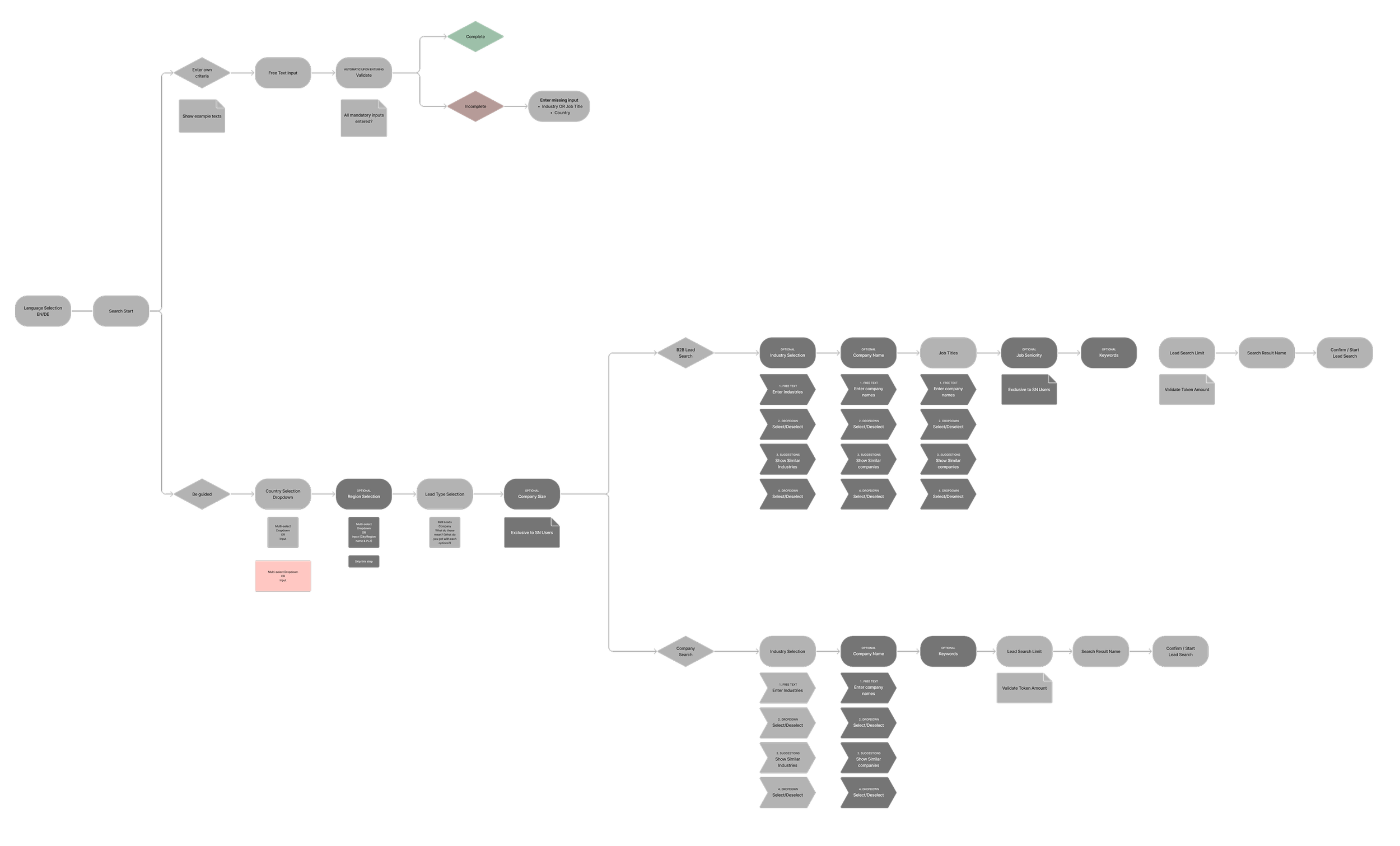
Because the process was linear, many data categories were interdependent. This created challenges in handling edits and edge cases, as changes in one area often had ripple effects across the flow.
Designing with these dependencies in mind was critical to ensuring a consistent and reliable user experience.
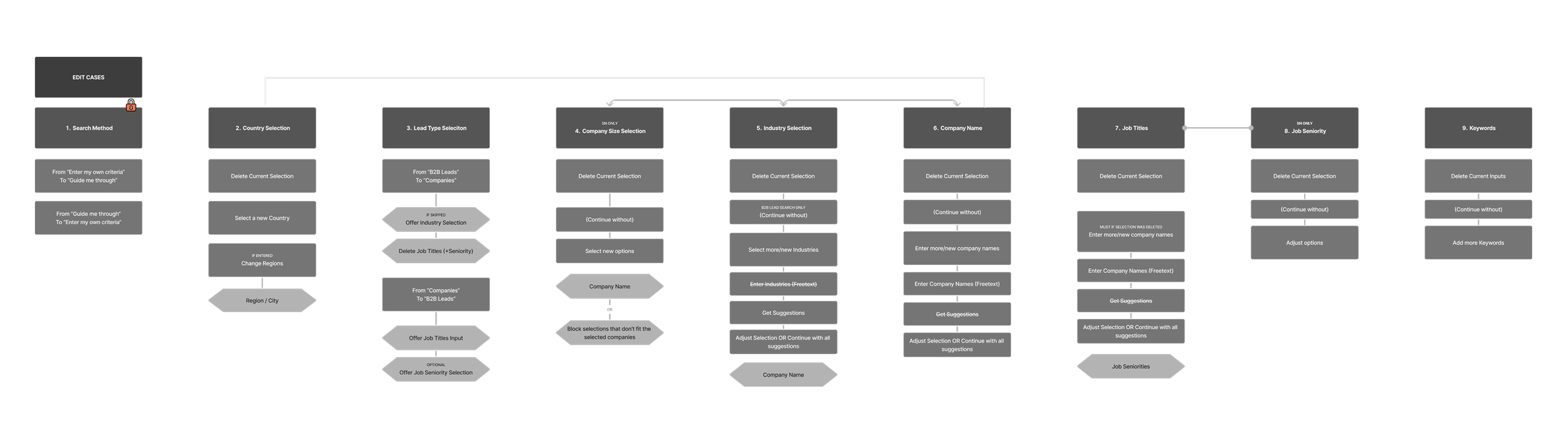
Mapping Edge and Edit Cases
To address the complexity of interdependent data, I created detailed mappings of potential edge and edit cases. This allowed me to anticipate where the process might break, define consistent rules for handling exceptions, and ensure that users could make adjustments without creating errors or inconsistencies in the flow.
Design Exploration 1
What didn’t work well:
The design assumed prior knowledge of search criteria, offering little support in guiding or simplifying the onboarding experience.
High entry barrier for new users:
Too little direction left new users unsure how to interact with the system, creating friction at the very first step.
Overwhelming lack of prompt guidance:
Power users had no was to bypass repetitive steps or accelerate the process, limiting workflow flexibility.
Lack of efficiency for experienced users:
Design Exploration 2
What didn’t work well:
Users often overlooked the prompt options, noticing them only mid-interaction or not at all.
Late discovery forced them to restart the process, creating unnecessary frustration.
Prompt selection lacked visibility:
While button-based selections reduced effort compared to free-text input, the flow still required multiple clicks. This made the experience too slow for active users who expected a faster, more streamlined path.
Limited efficiency gains:
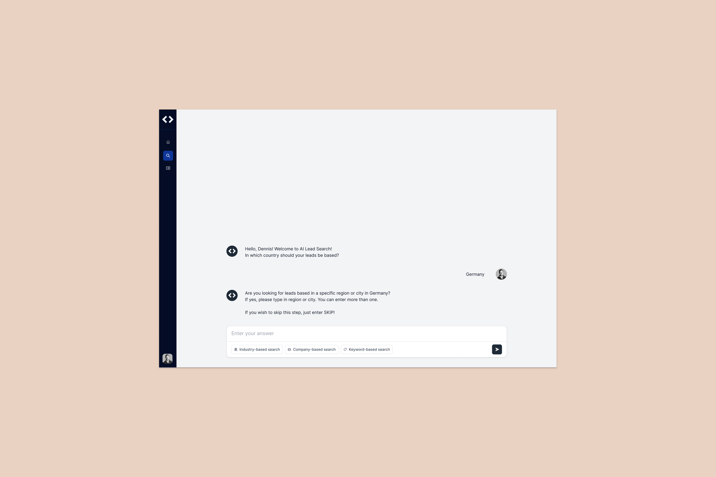
Design Exploration 3
What’s working well:
Pre-populated prompts reduced “empty searches“, helping first-time users succeed quickly.
→ Design intervention:
Added a prompt selection upfront. Pre-populated prompts gave users a guided starting point.
Prompt selection for new users:
Power users could skip prompt selection and jump straight into criteria, keeping workloads fast and efficient.
→ Design Intervention:
Allowed advanced users to bypass prompt selection and jump directly into building precise searches.
Flexible search for active users:
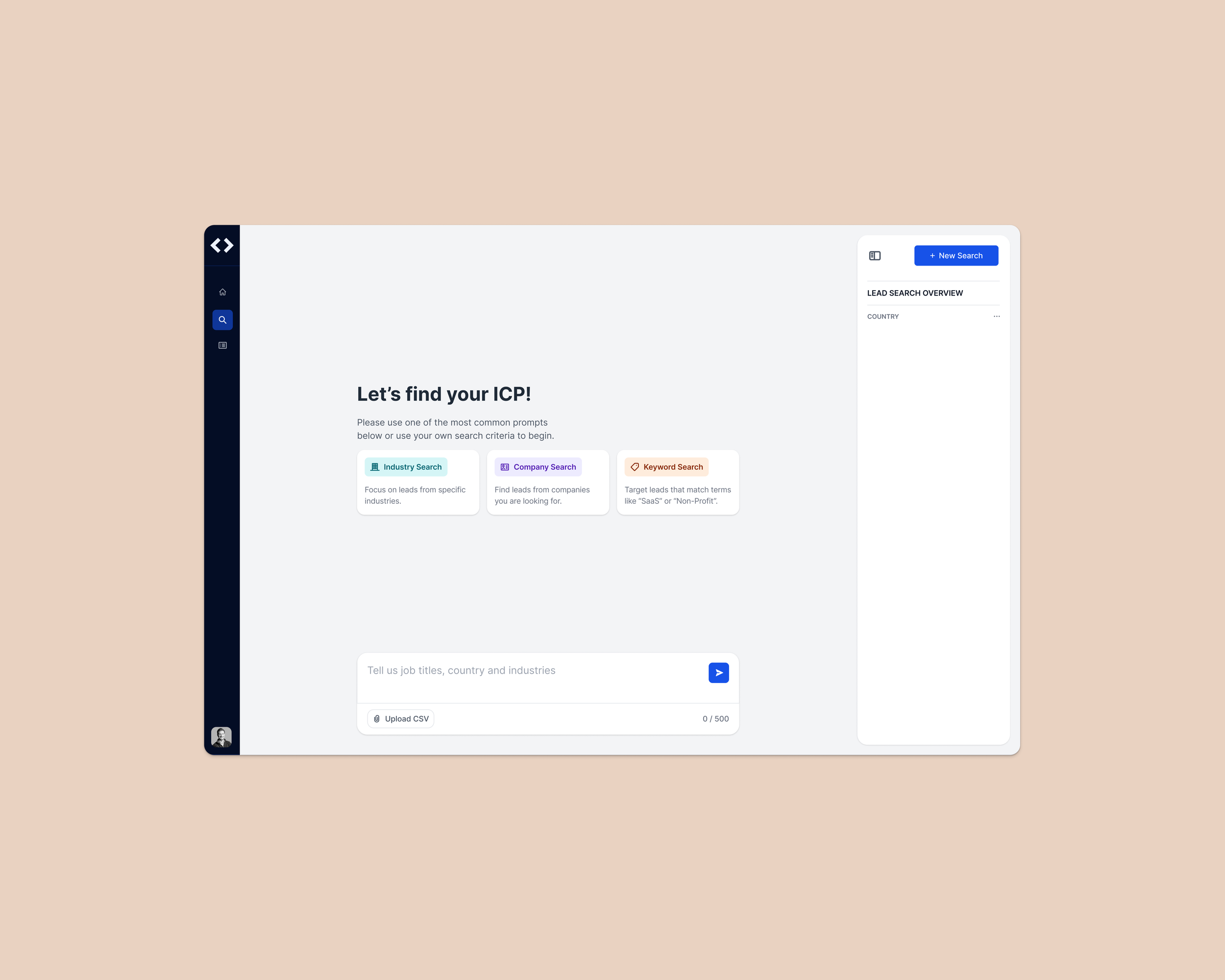
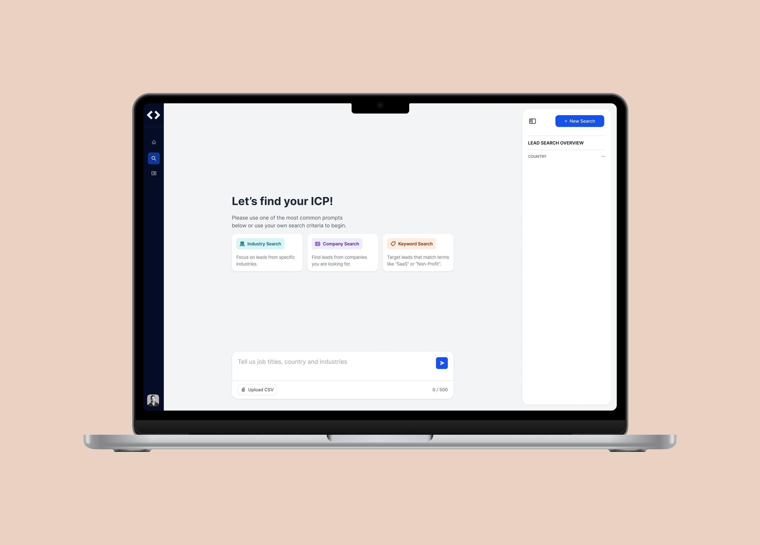
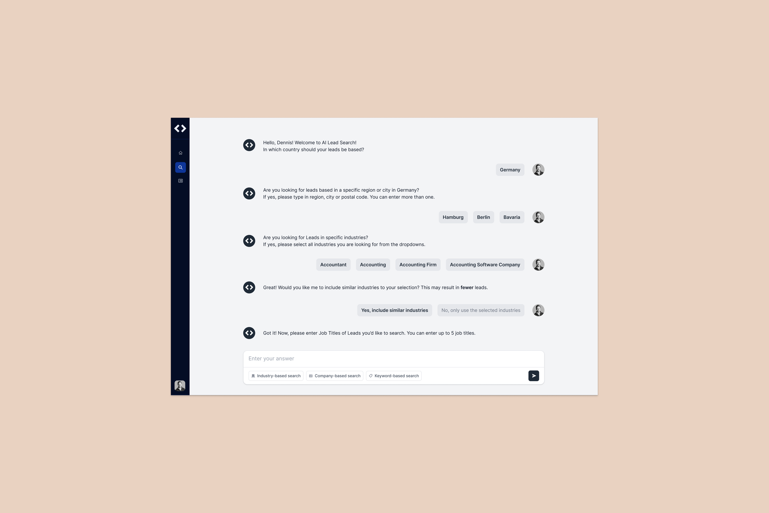
Final Designs
Users could begin a search either by selecting a pre-defined prompt or by entering their own criteria in free text. This dual approach gave experienced users a fast track to result while guiding new users step by step, helping them succeed without needing to figure out the process on their own.
Two entry points to lead search
Usability Testing at
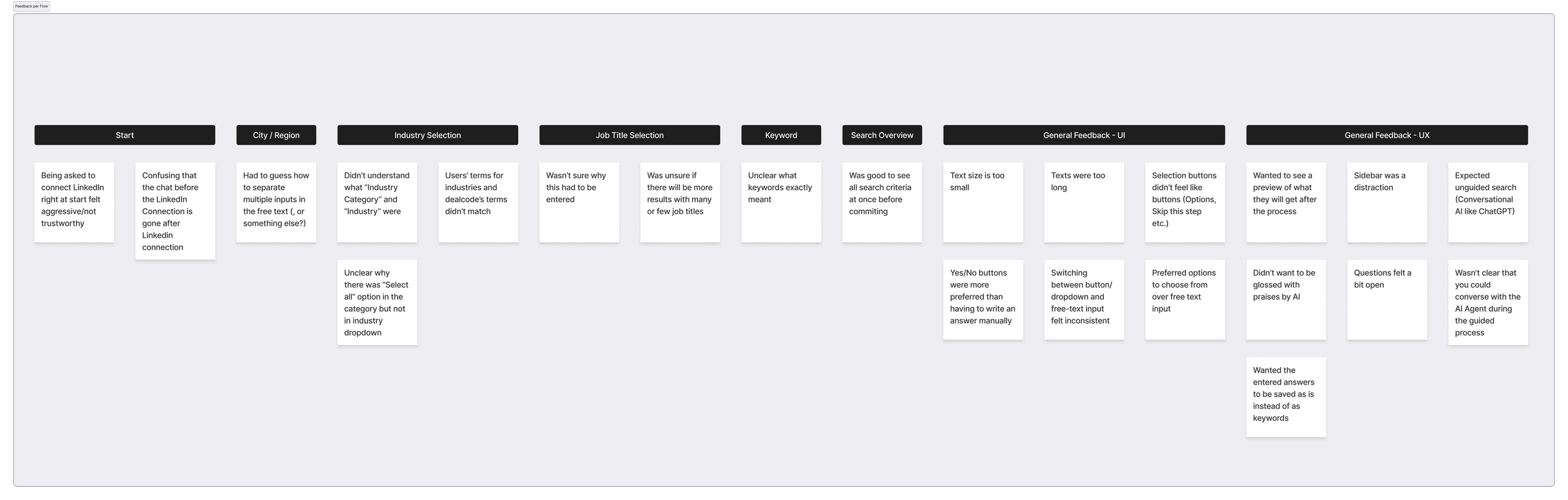
All users could finish the task without intervention.
Test Booth 8 (dealcode ai), tested with 6 testers on 18.09.2025 in Caffamacherreihe 7, 20355 Hamburg during the Usability Testessen 2025.
lmpact
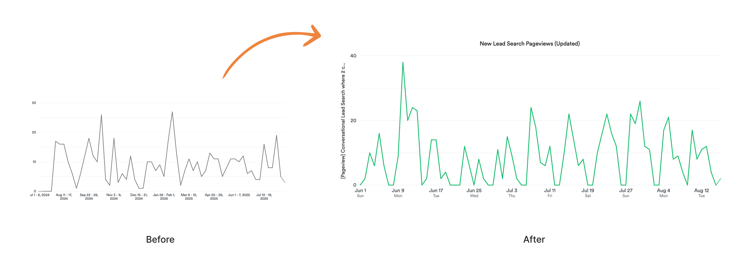
New user engagement increased by ~9%
Validating that the redesign helped new users succeed faster without adding friction for active users.
Reduced customer success support ticket by ~67%
The redesign significantly reduced friction for new users. Support tickets related to lead search dropped by 67% in the first month post-launch (12 → 4). Of the remaining 4 tickets, 2 were unrelated to design (bug repor ts), showing that usability-driven issues were nearly eliminated. This directly reduced Customer Success overhead and validated the new experience.
Learnings
This project taught me the value of designing at the intersection of product goals customer success insights.
We needed to increase engagement and drive conversions from free to paid users
From the product side:
Recurring support tickets revealed friction points that were preventing users from adopting the feature confidently.
From the customer side:
By bringing these two perspectives together, I was able to:
Identify usability pain points that weren’t visible in analytics alone.
1—
Prioritize design decisions that not only improved the user experience but also reduced the operational burden on the support team.
2—
Create a flow that served both new users and active users, ensuring that both onboarding and advanced use-cases are efficient.
3—
Key takeaway:
pairing product growth objectives with frontline customer feedback results in solutions that are not only user-friendly but also directly reduce operational costs, creating a win-win for both the business and its users.
View Project Documentation ↓